

Personal Markup: Redesigning for Usability and Flexibility
A mobile-first annotation tool for field workers to quickly and safely perform data collection and communicate across teams.
Company
Esri
Timeline
6 months
Responsibilities
UX/UI Design • Accessibility • Documentation • Developer Handoff
Team
Product Designer I • Sr. Principal Product Designer • 2 QA Engineers • 2 Developers

Overview
Personal Markup is a mobile-first, freeform tool that allows field workers to sketch notes, annotations, and visual markings directly on a map—supporting rapid communication between field teams and back-office stakeholders without requiring GIS admin setup.
Unlike structured data capture, Markup supports flexible, in-the-moment workflows, making it especially valuable for planning work areas, documenting site conditions, and sharing context quickly across teams.
A large number of organizations rely on this feature—roughly a third of the Field Maps user base.
This redesign was delivered as part of the larger mobile platform rebuild, which meant improvements needed to stay tightly scoped while addressing the most impactful usability issues.
Problem
Through centralized research and ongoing customer feedback led by Product Managers, the team identified recurring pain points in the existing Markup experience:
Accidental drawing when users attempted to pan the map
Difficulty moving or selecting sketched items
Poor discoverability of tools
Inconsistent interaction patterns between iOS and Android
Limited clarity around drawing modes and actions
Friction when managing sketches after creation
These issues made a core workflow feel unpredictable and harder to learn—especially for non-GIS users.
Because Markup was being redesigned alongside a broader app rebuild, the team made a deliberate decision:
Rather than introducing new capabilities, focus on improving clarity, predictability, and control within existing functionality.

Goals
To reduce accidental interactions and restore expected map behaviors.

Research
Insights came from multiple sources:
Centralized research findings shared across teams
Continuous customer feedback surfaced by Product Managers
Usage patterns from existing Markup workflows
Design audits of current UI and interaction models
These inputs helped categorize opportunities into must / should / could, allowing the team to prioritize the most impactful usability fixes within rebuild constraints.
Design Approach
We approached the redesign in two phases, starting on iOS before establishing parity on Android.
Enhancing Existing Patterns
The first exploration focused on improving the current experience using familiar platform conventions:
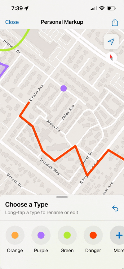
Introducing explicit tool selection before drawing
Adding instructional cues to guide user actions
Separating color and type selection so users could configure attributes before or after drawing
Restoring standard map panning with one finger
Adding clear undo and editing controls
The goal was to align Markup with users’ existing mental models: choose a tool first, then act—rather than drawing immediately on touch.
This phase emphasized clarity, predictability, and reducing cognitive load.

Exploring New Interaction Models
In parallel, we researched patterns from other drawing and annotation tools to explore alternative interaction approaches. This led to experimenting with custom UI that provided clearer tooling and flexibility while still respecting native platform behaviors.
Through multiple rounds of iteration and stakeholder feedback, we converged on a redesigned flow that balanced:
Familiar mobile interactions
Explicit tooling and labeling
Flexible drawing modes
Platform consistency across iOS and Android

Key Design Decisions
Rather than expanding Markup with new features, we prioritized usability within existing capabilities:
Require explicit tool selection before drawing
Add instructional text and labels for key actions
Allow users to choose type and color independently
Restore standard pan/zoom behavior outside of drawing mode
Introduce clearer undo and edit affordances
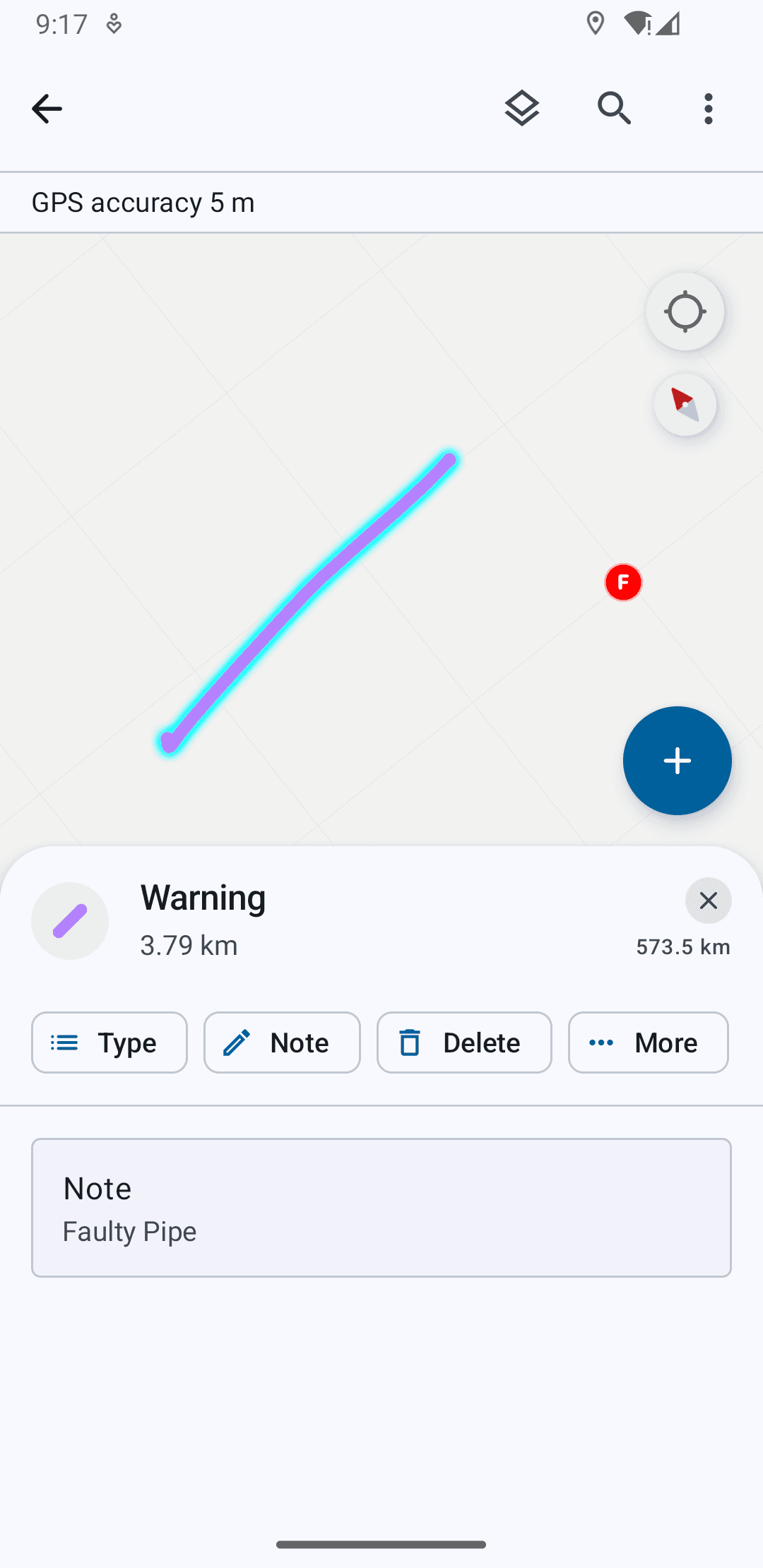
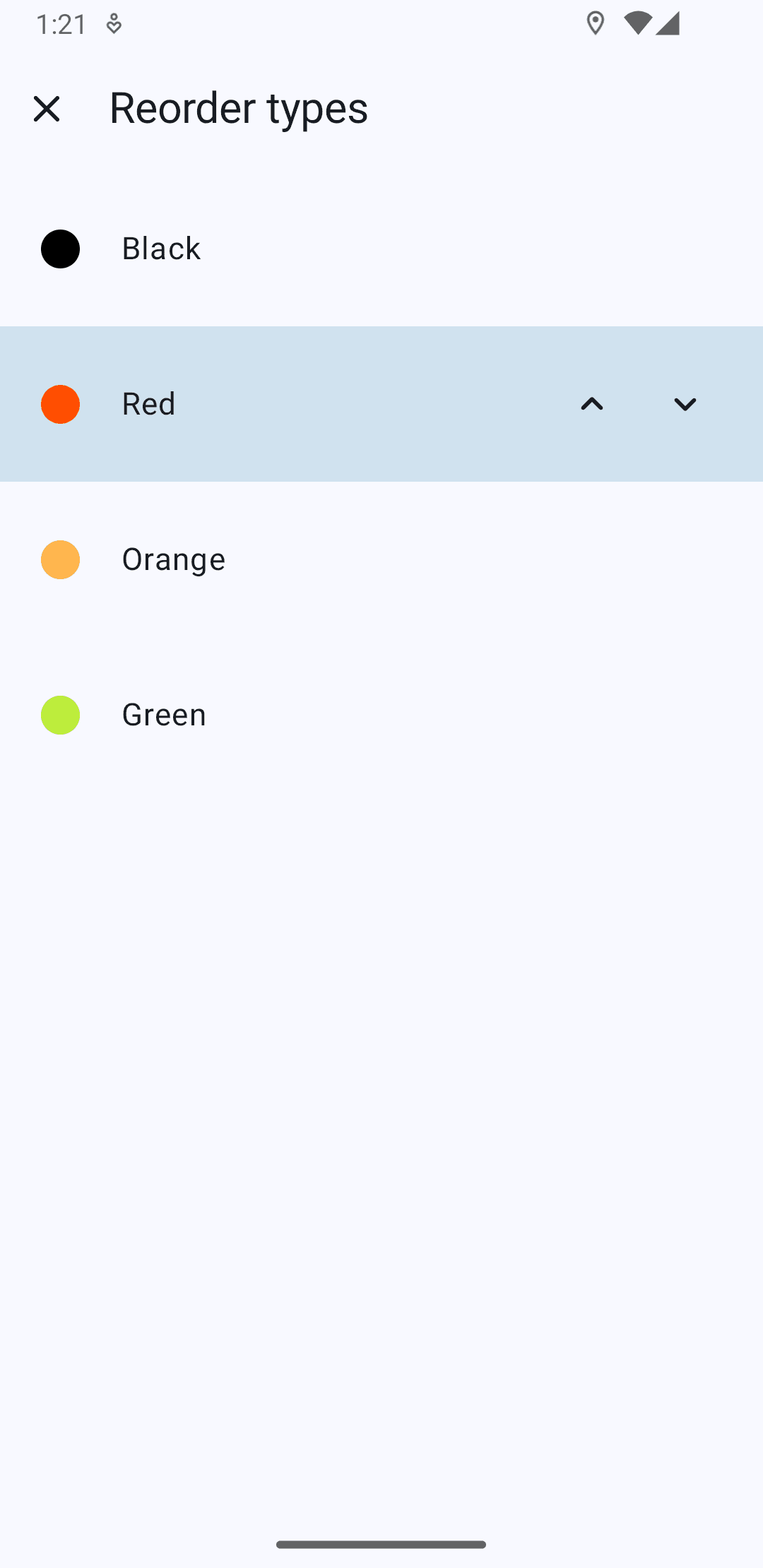
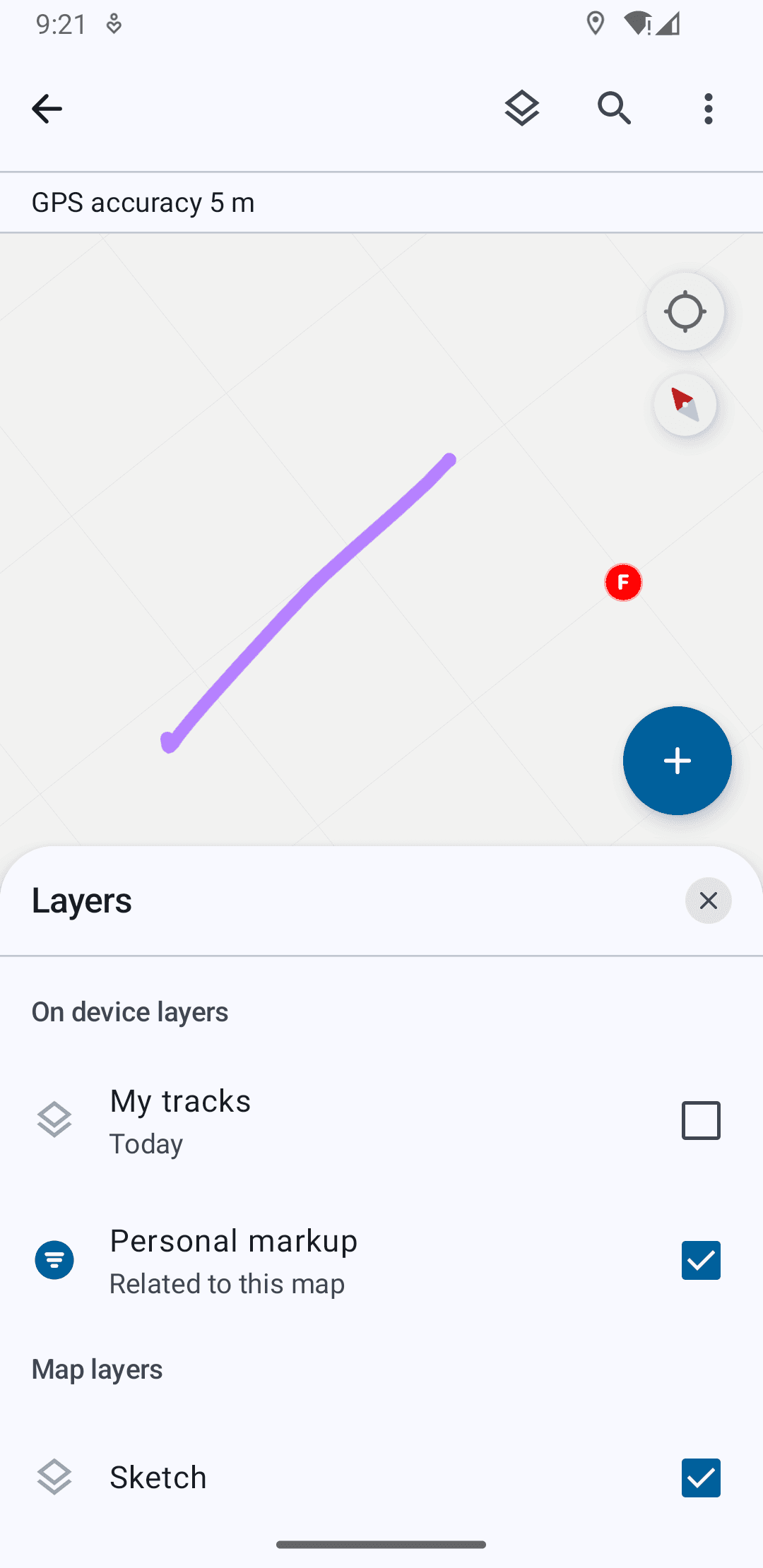
Improve post-markup management (layer visibility, reordering, sharing)
Support stylus input on larger form factors, enabling precise drawing while preserving finger-based navigation
These decisions focused on making the experience more approachable for non-GIS users while preserving power for advanced workflows.
Outcome
The redesigned Markup experience delivered:
Clearer tool hierarchy and labeling
More predictable gesture behavior
Reduced accidental drawing
Improved navigation between map and markup states
Stronger post-creation management of sketches
Stylus support for precise field annotations
These changes translated complex spatial annotation into simpler, task-oriented interactions—making Markup more reliable and approachable in real-world field conditions.
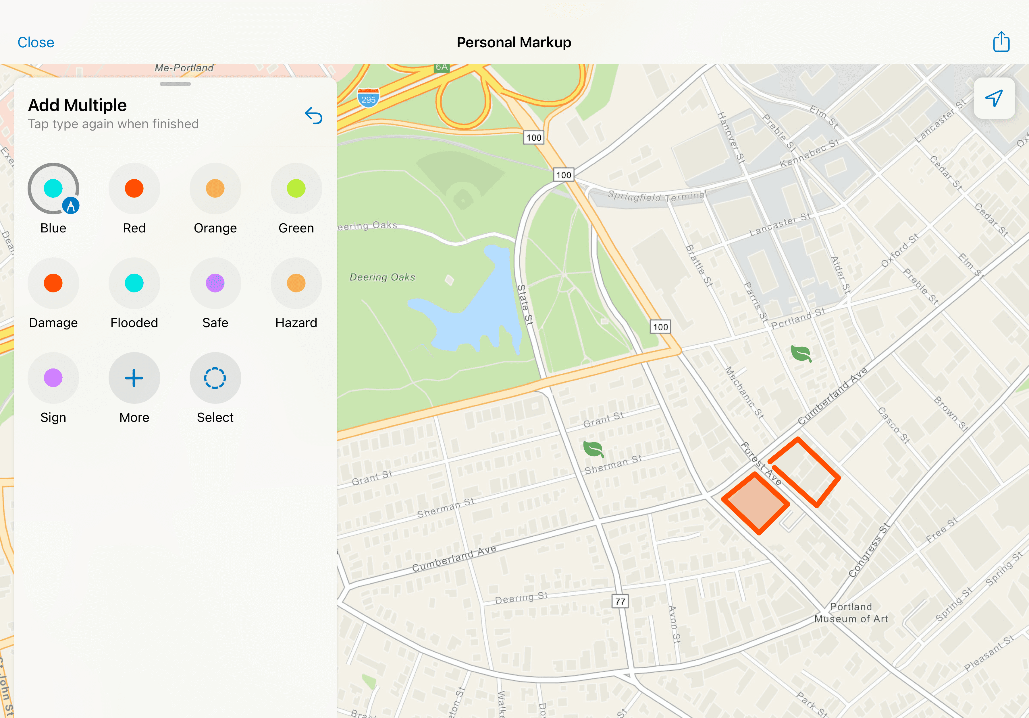
Implicit & Explicit Gestures
Pan/Zoom, drawing different forms, selecting multiple items, and moving them on the map.


Post-Markup Management
Viewing drawn item details and actions, toggling visibility across maps, and sharing settings.


Stylus Recognition on Tablet
Users can draw with the stylus and pan and zoom with their fingers.

Platform Parity
Designs were finalized first on iOS, then adapted for Android to achieve parity while respecting platform conventions. Where native components differed, we made intentional choices between visual parity and implementation parity—favoring long-term maintainability and reuse over one-off custom solutions.
This ensured the experience felt native on each platform while remaining structurally consistent.

Metrics
Following the release of the rebuilt Markup experience in October 2025:
Thousands of unique users engaged with the new Markup workflows in the first two months
Ongoing telemetry and customer feedback continue to inform iteration and refinement
The redesign improved usability while staying aligned with the broader platform rebuild, demonstrating how targeted human-centered improvements can ship successfully within large system modernization efforts.
Reflection
This project reinforced the importance of designing within constraints. Working on Personal Markup highlighted how meaningful UX improvements don’t always require new features—often they come from clarifying intent, restoring familiar patterns, and reducing friction in existing workflows.
By partnering closely with Product and Engineering, we balanced human-centered design with platform realities, delivering a more predictable and accessible experience while contributing to a scalable foundation for future growth.
Personal Explorations: Designing for Assistive Spatial Intelligence
Taking it Further
The ideas I discuss further are not part of shipped work, but my own explorations thinking about more intelligent and system-level consolidation of workflows to support field efforts. And so, what if a sketch could do more than one thing?
The personal markup redesign began as a way to make freeform annotation faster and more intuitive. From research however, it was clear that markup wasn’t just a drawing tool, but a way for users to express intent like identifying a hazard, outlining work zones, organizing tasks, etc.
I used this to ideate on shifting markup from capturing information to interpreting and acting on it.
Feature Level - Assistive Linking of Objects Within a System Layer
I explored a system that detects nearby features and surfaces non-blocking suggestions directly within the existing workflow. The user creates a markup and the system identifies any assets in proximity that might be relevant to link based on a distance threshold and the name/type of markup.
Users can link, add and view any assets or dismiss suggestions that may not be relevant. This behavior keeps the interaction inline, non-disruptive, and reversible.
Rather than auto-linking, the system interprets intent signals like proximity and context and proposes actions:
Suggestions appear only when confidence is meaningful
The user remains the decision-maker
The system supports, but does not override
This preserves markup as a user-owned layer, while reducing manual effort.

Area & Workflow Level - Facilitating Intelligent Task Coordination
Since Field Maps also introduced spatially enabled task creation and completion with the new release, I took the opportunity to explore markup as a context-aware system that understands intent at an area level, not just individual features.
As part of its functionality, users can view spatially marked "tasks" on the map and mark their progress and completion. Each task can be marked with a priority, an assignee, due date, status, etc. and supervisors and field workers use this as a to-do list for field work.
In this exploration, when a user draws and labels a region (e.g., “Work Area 1” or “Team 1”), the system interprets it as a meaningful spatial container.
Within this boundary, the system can:
Detect tasks and assets contained in the area
Understand assignment status (assigned, unassigned, completed)
Evaluate priority and proximity or other metrics based on the type of task sorting enabled by the user
Summarize workload across the region
This transforms markup into a queryable interface for operational data.
Assistive Workload Intelligence for Field Workers
This sequence shows how a user-defined markup evolves into a coordination layer.When a region is defined as a work area, the system interprets it as a spatial boundary and begins to aggregate and analyze tasks within it, which removes the cognitive load of interpreting larger list-based filters.
Progressive Disclosure of Insight
Detection
The system parses the area and evaluates contained tasksSummary
Key signals surface inline:Assigned vs unassigned
Priority
Progress
Contextual Action
Suggestions to guide next steps (pick up unassigned tasks)
Scalability
Fewer tasks = direct preview
More tasks =a summarized view with “View All”
This keeps the experience scannable and reuses existing UI patterns in the app.

Planning Work Areas with Assistive Insight for Supervisors
Planning Work Areas with Assistive Insight for Supervisors
This design explores how field supervisors can use markup not just to define space, but to plan and validate work distribution in real time.
They may outline an area for assignment to a team, and the system interprets the region as a planning boundary, surfacing feedback by analyzing the tasks within it and providing an assignment action.This transforms area creation from a static action into a feedback-driven planning loop. Here too, the suggestion is immediate, contextual and reversible.
Rather than adding complexity, the system leverages what users already do, and augments it with meaningful, relevant insight.

See more projects


Go Back