
THE SPACE
Thousands of unique organizations, making up to a third of our total base, use markup as a tool in the field to support their workflows across different industries. Why? This is because of the flexibility it provides to sketch freeform map items– a direct contrast to precise data collection that is the central offering of Field Maps.
Bridging Gaps
Markup does not need the organization or team to have a GIS admin to set it up.
User-First
It is optimized from a mobile-user-first perspective because it is a mobile-only feature.
Low Reliance
Sketched items are local to the device, so there is less risk of altering shared data on-the-fly until explicitly uploaded and reviewed.
WHAT ARE OUR USERS DOING WITH MARKUP?
Main use cases include using it as a way to plan areas of work and provide their status, or capture quick/rough information outside of any map configurations.
Our users liked that it was rapid, personal, adaptable, and communicable.


BUT, THE PAIN POINTS.
Users reported difficulty with navigating the interface with certain touchpoints like:
Panning on the map in markup mode
Moving sketched items
Adding individual points
Finding tools
Having sketches made in one map persist across others rather than be visible in just the initial one
AT MINIMUM, WE DECIDED ON A REDESIGN TO ADDRESS THE MOST REPORTED UI ISSUES.
We made a list of the must, should and could opportunities and narrowed them down to a few that fit within the realm of a redesign. This removed the overhead of additional capability during an app rebuild, which would also require further research.
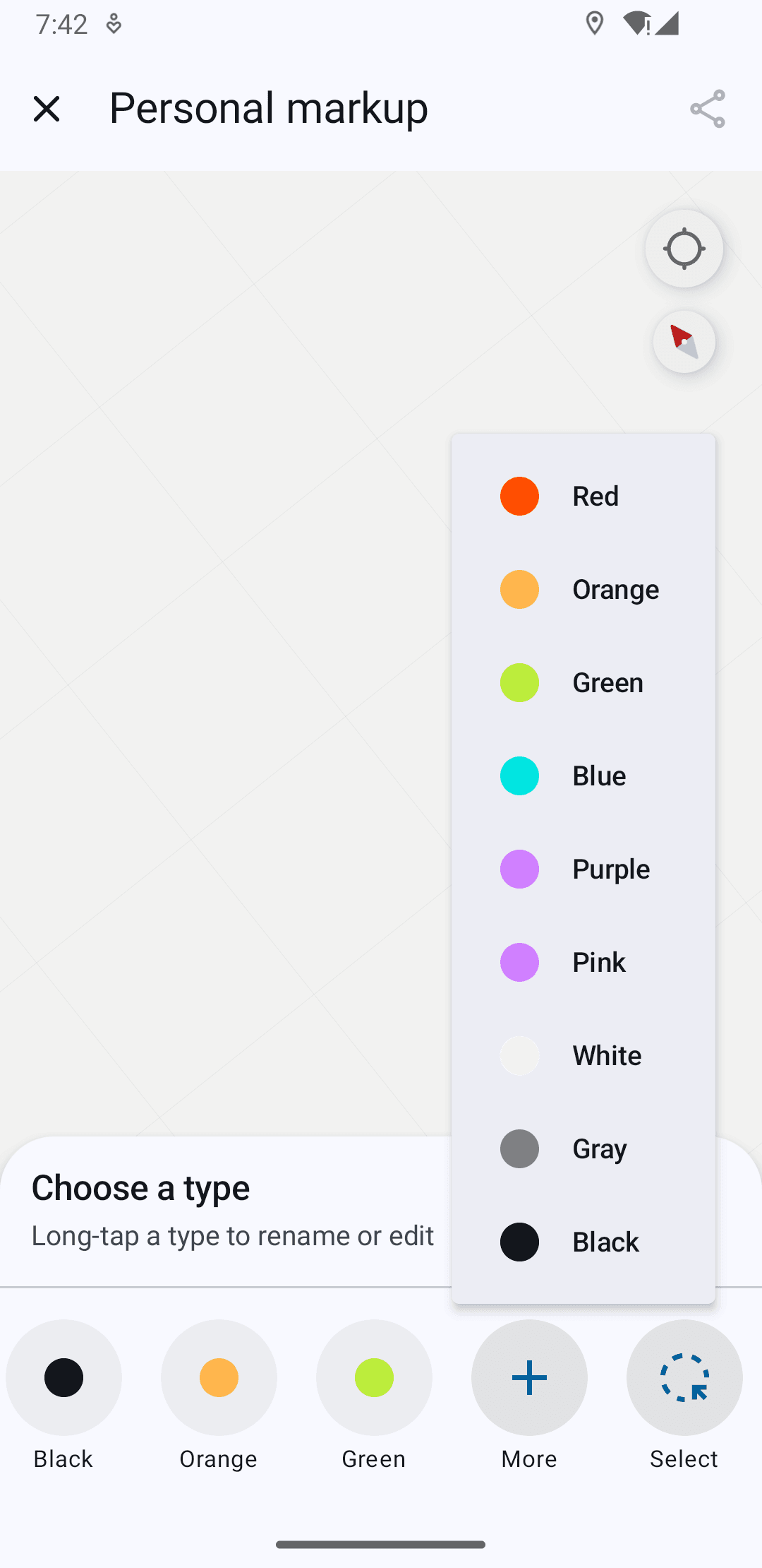
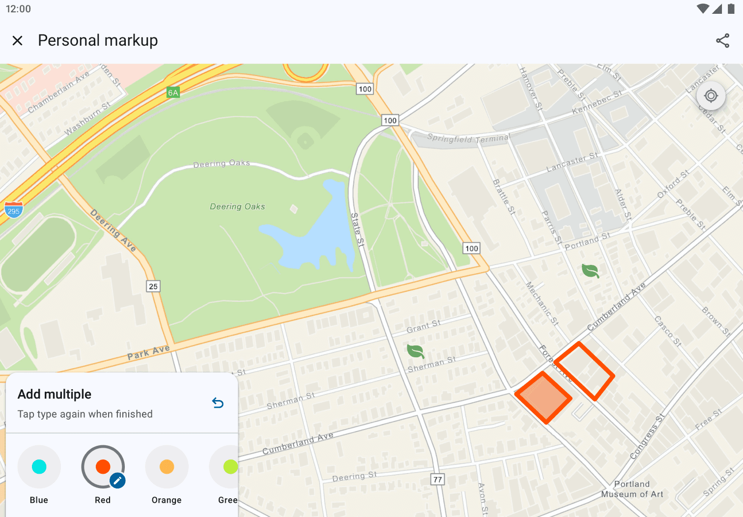
The Old Interface
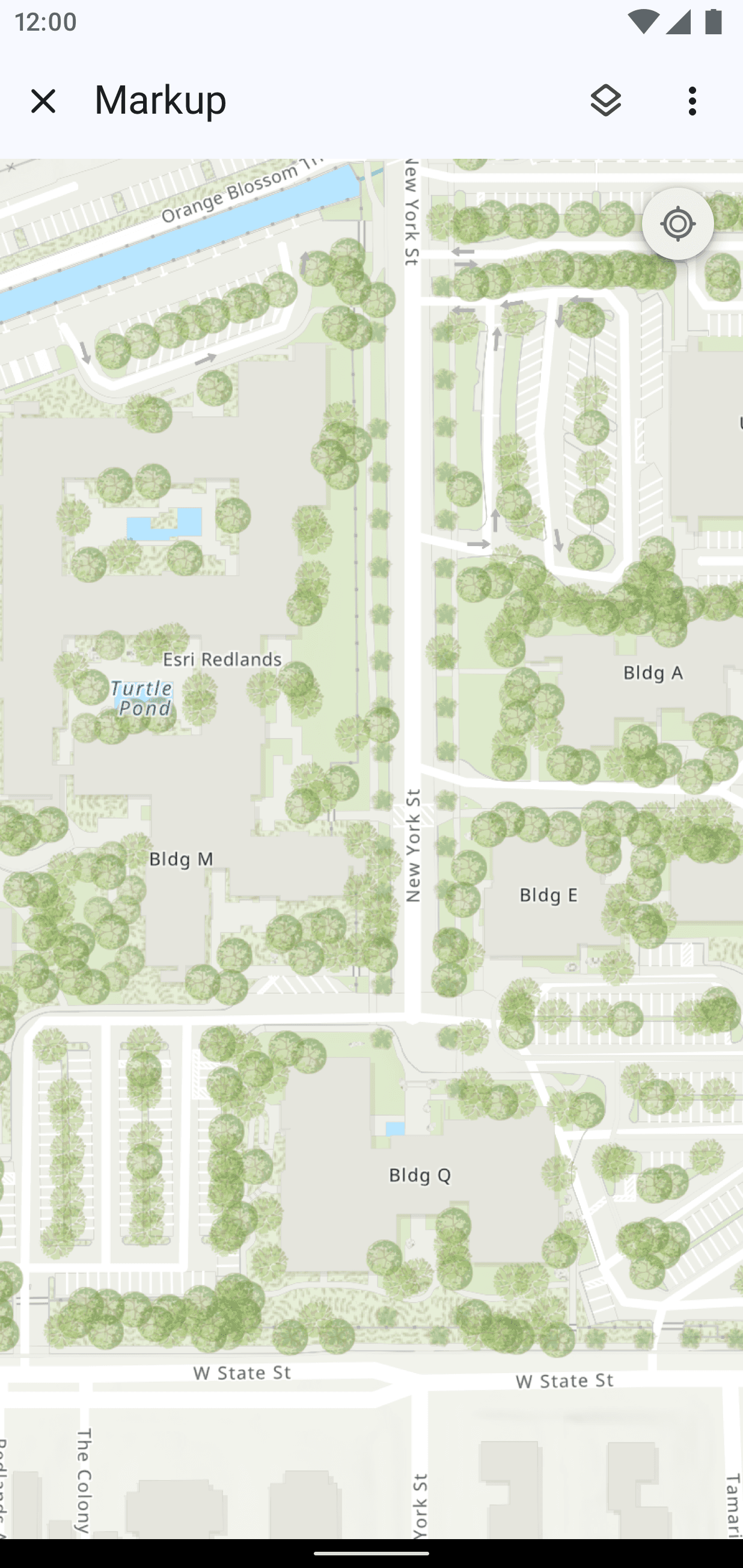
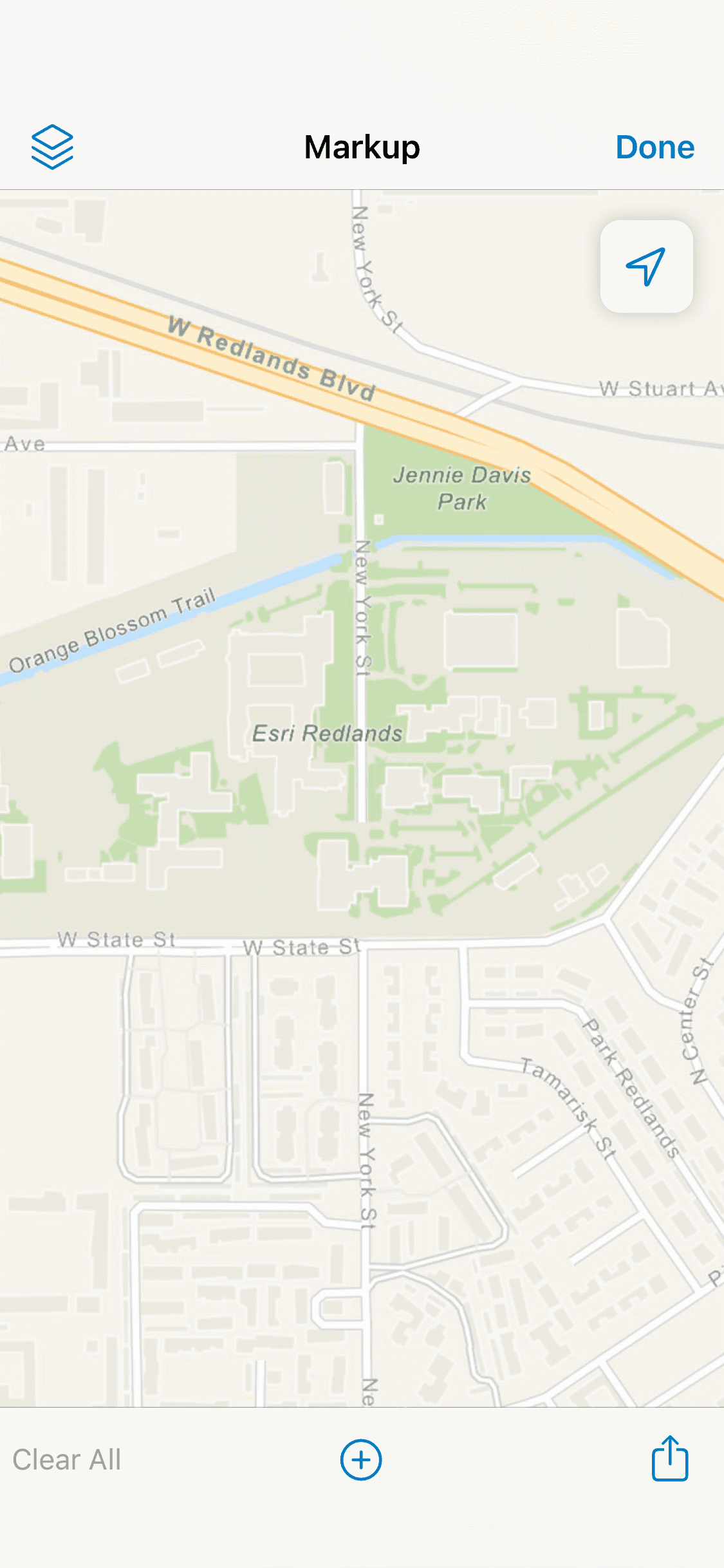


On Tool Open
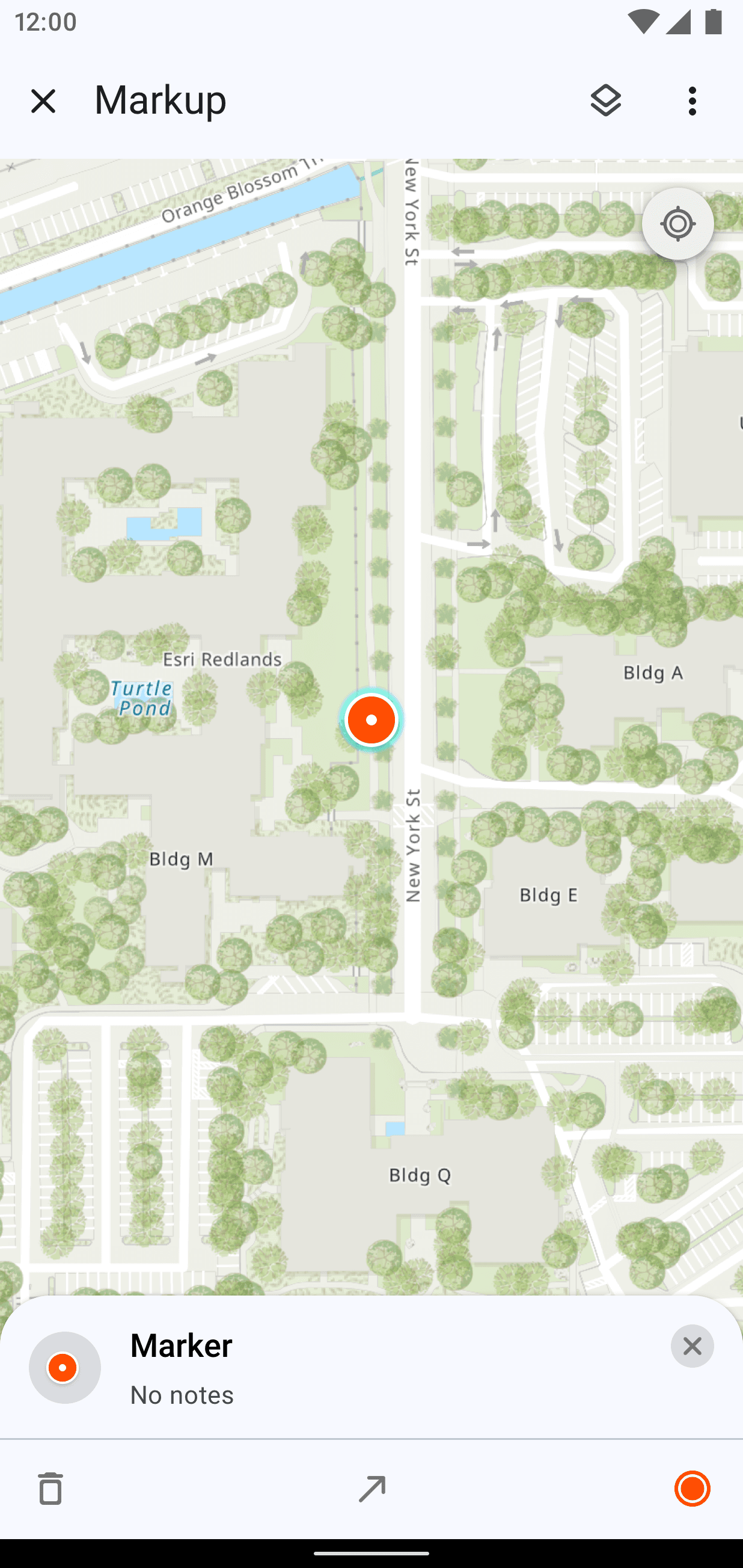
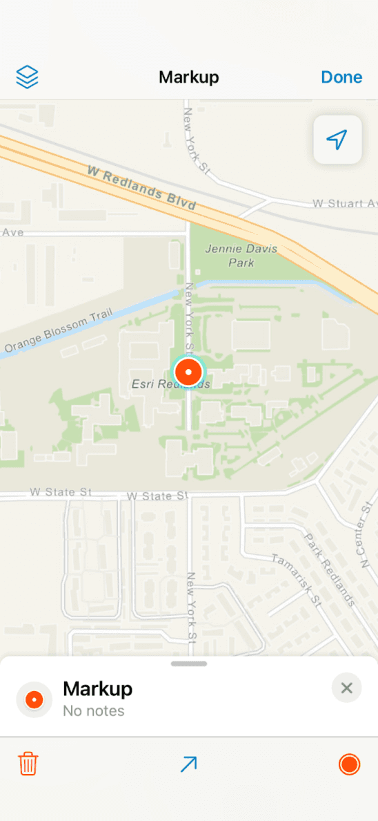
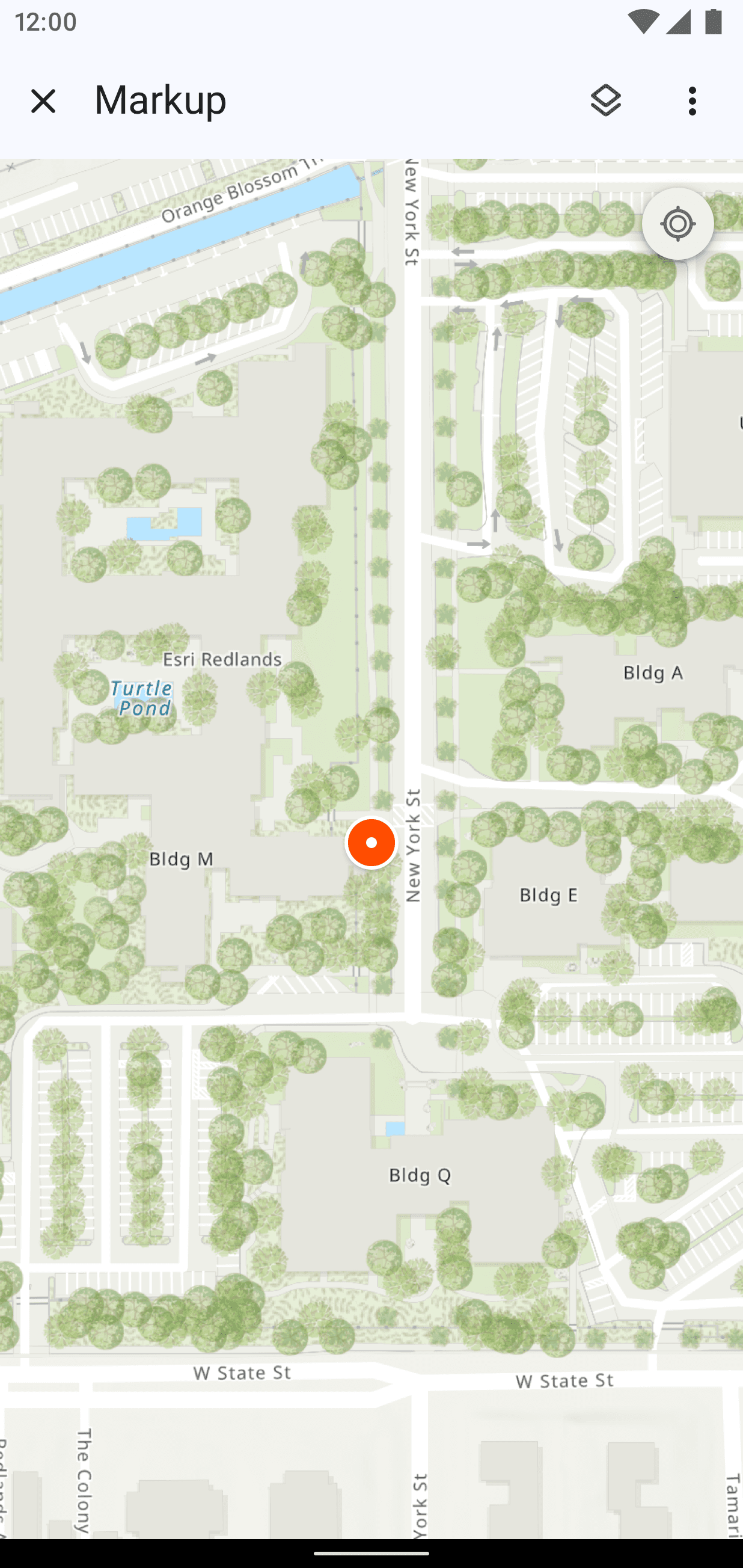
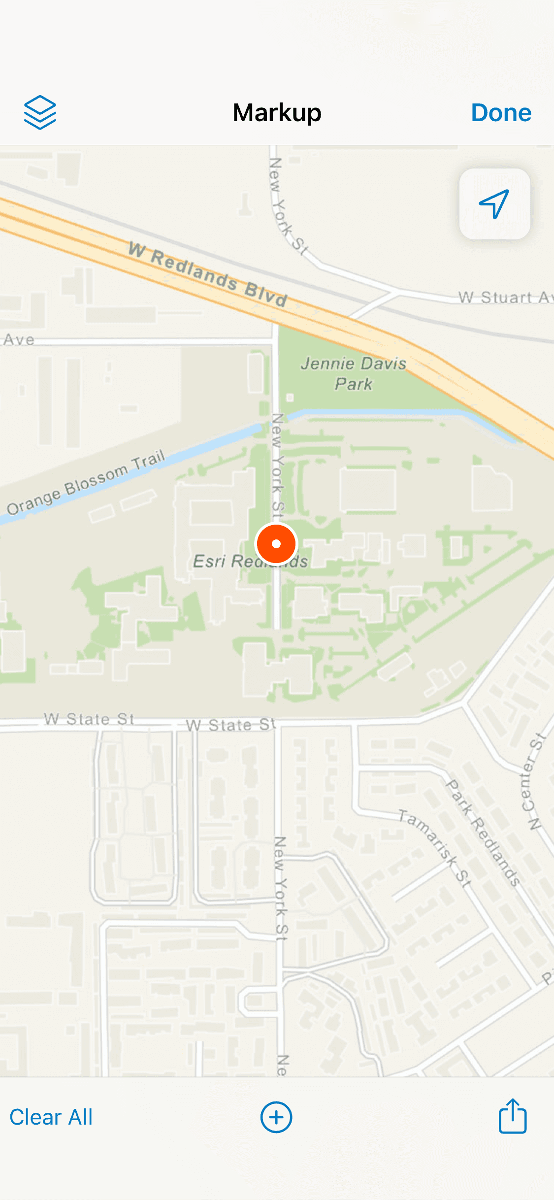
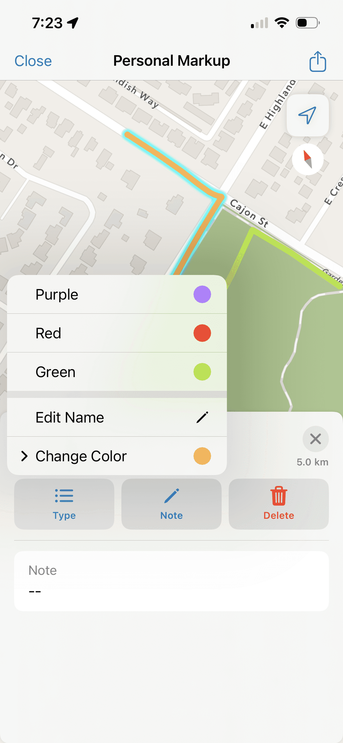
Here is the UI of some of the first steps a user might have taken on opening Markup in Field Maps. The feature overall allows them to add “markers” or points, draw lines and closed areas, and edit their color/form/notes.
However, some pain points mentioned by users become apparent.
Lack of clarity. One would expect to pick a tool before they draw on the map surface, but there is a lack of that expected entry point.
Subversion of established mental model. In the map view outside this feature, dragging your finger on the map pans it, but here, doing the same action without selecting anything would draw something immediately.
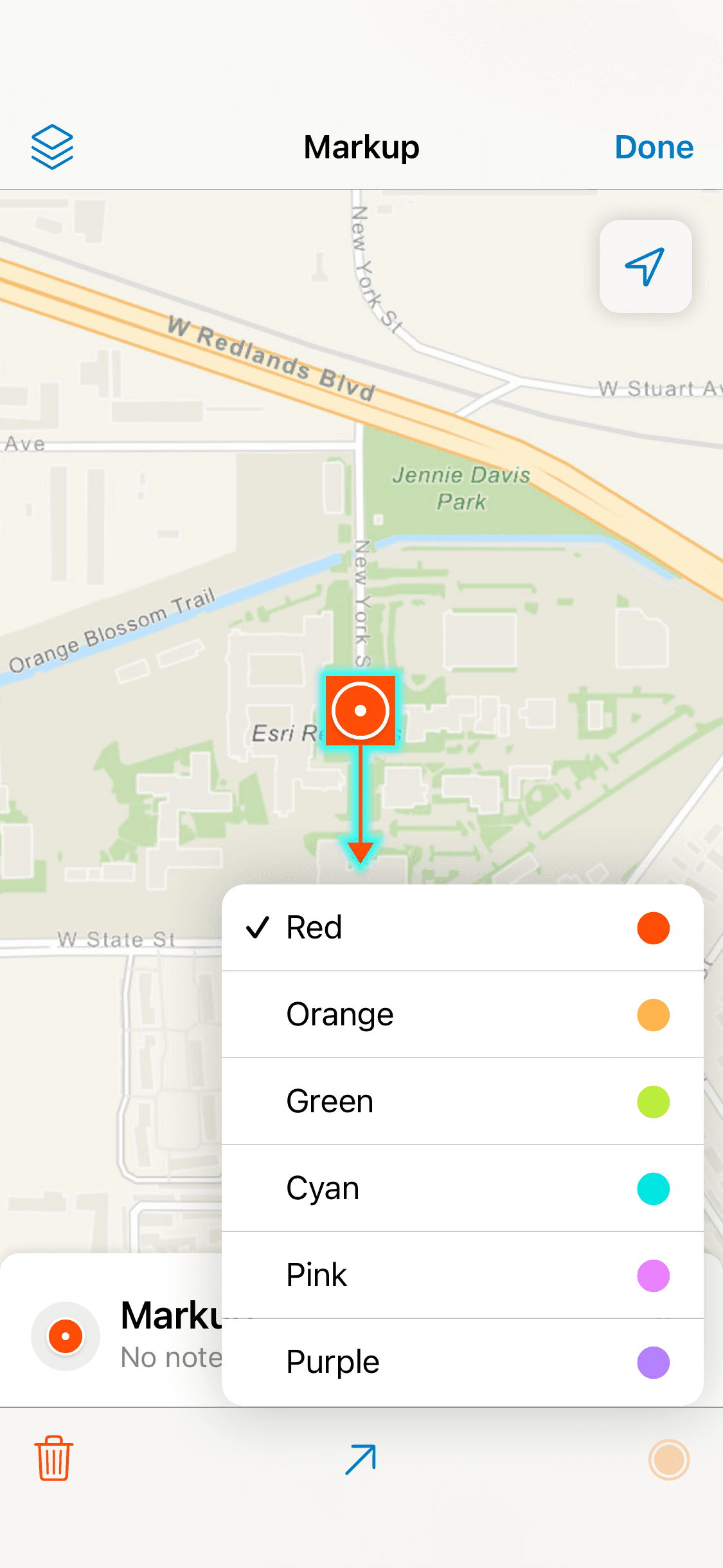
Backward process not conducive to planning. A default color (red) for the item was already set - users would then change the color and name after drawing.
Android specifically was missing a lot of UI cues since the toolbar wasn’t visible until after a drawing was made or an item was selected. Dropping a marker required a long press on the map where iOS had a specific button.
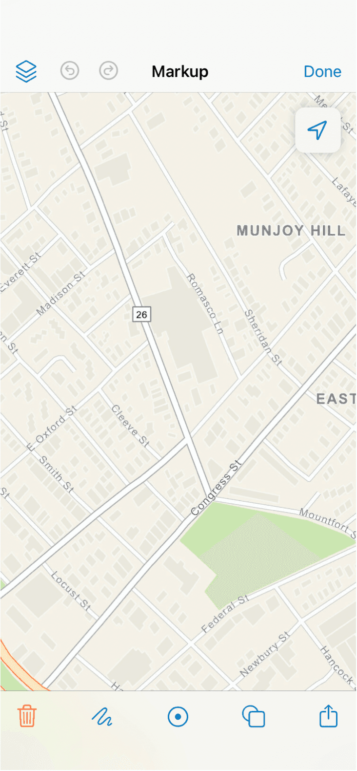
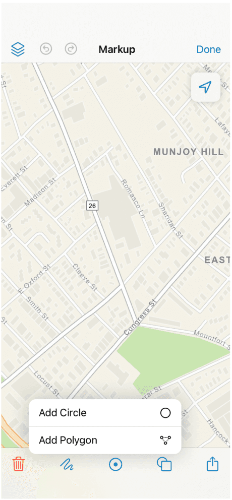
I. Enhancing Current Patterns
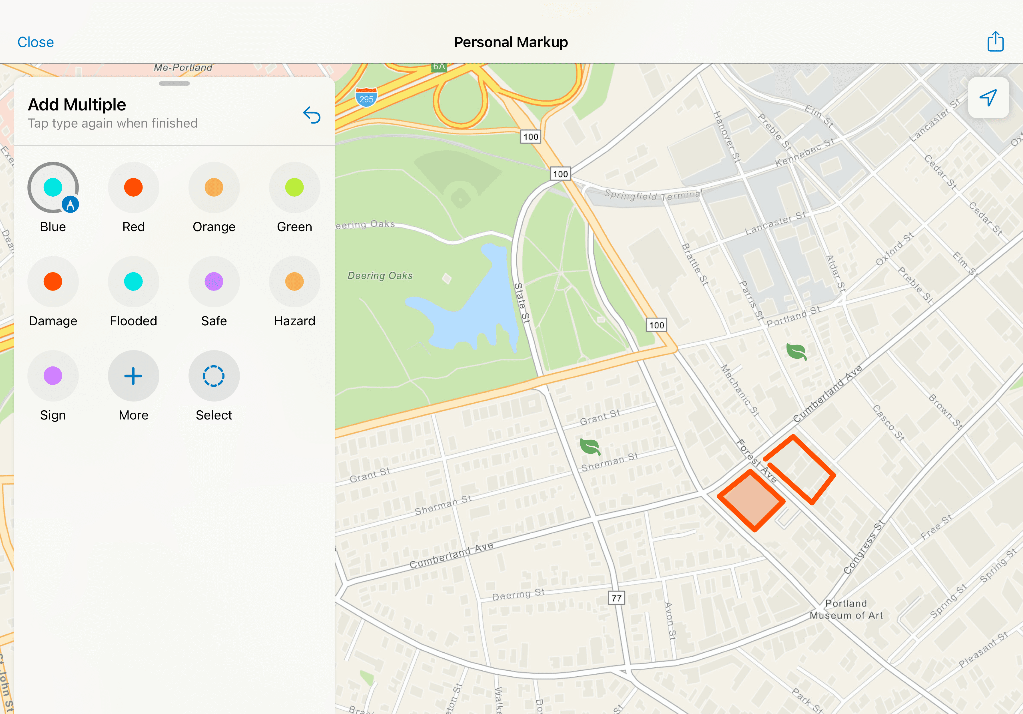
First pass of design ideation was to look at ways to rework the UI by utilizing some existing patterns and components. I started sketching keeping iOS is mind to nail down a flow on one platform before working to adapt it to Android for consistency.
Potential Markup Open with Specific Tools
Using the Sheet Header Text as Instructional Cues for User Actions
Highlighting the Name of the Layer the Markup is Added to
My overarching goal was to add explicit actions and labels to all the different variations of markup that Field Maps supported.
II. Making Something Different
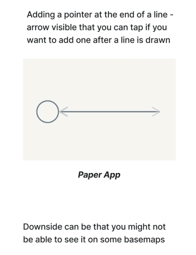
The next pass of design was preluded by research into other markup/drawing apps (Paper, Flow, Esri's Survey123, Apple’s Freeform, etc.) and patterns to adapt those into a fresh UI in Field Maps. We decided as a team that it was worth exploring different interactions for new custom components. This provided some more flexibility.
Instructional Text + Custom UI + Explicit Tooling
Research Notes
Above are examples of newer UI patterns that still incorporate clear tooling and direction from the previous round.
Redesign with Platform Parity
After several rounds of ideation and stakeholder feedback, this is the flow that was settled on. First on iOS, followed by parity design work on Android. Some examples of key UI touchpoints -
Old
New
Old
New
Old
New
Old
New
Old
New
New
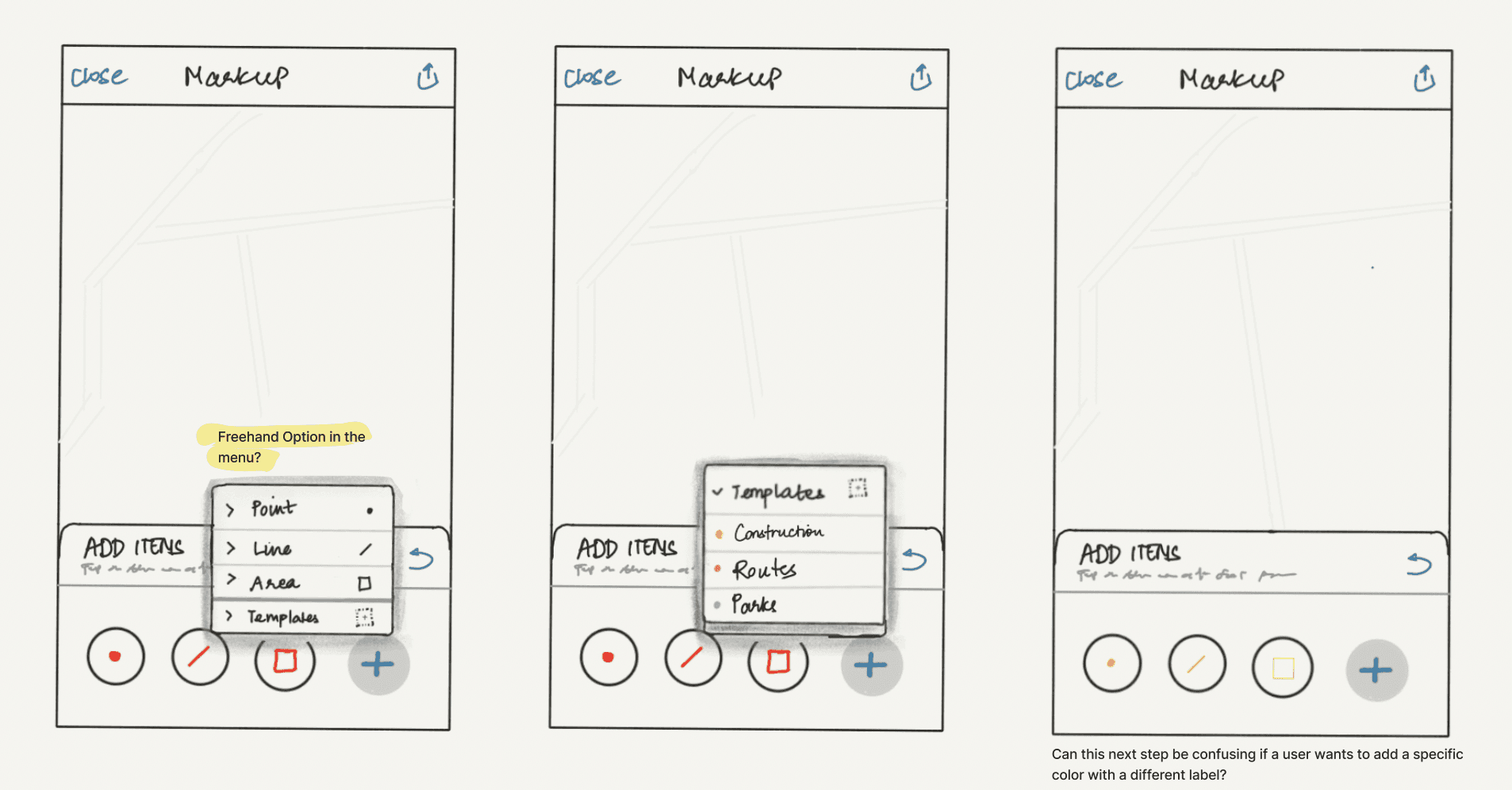
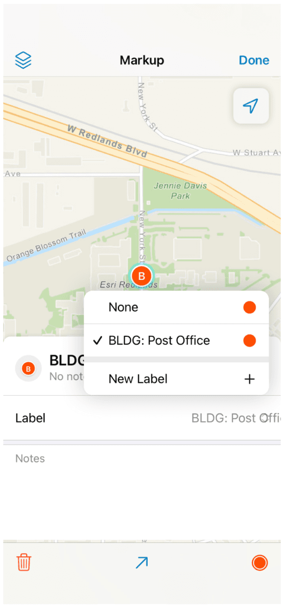
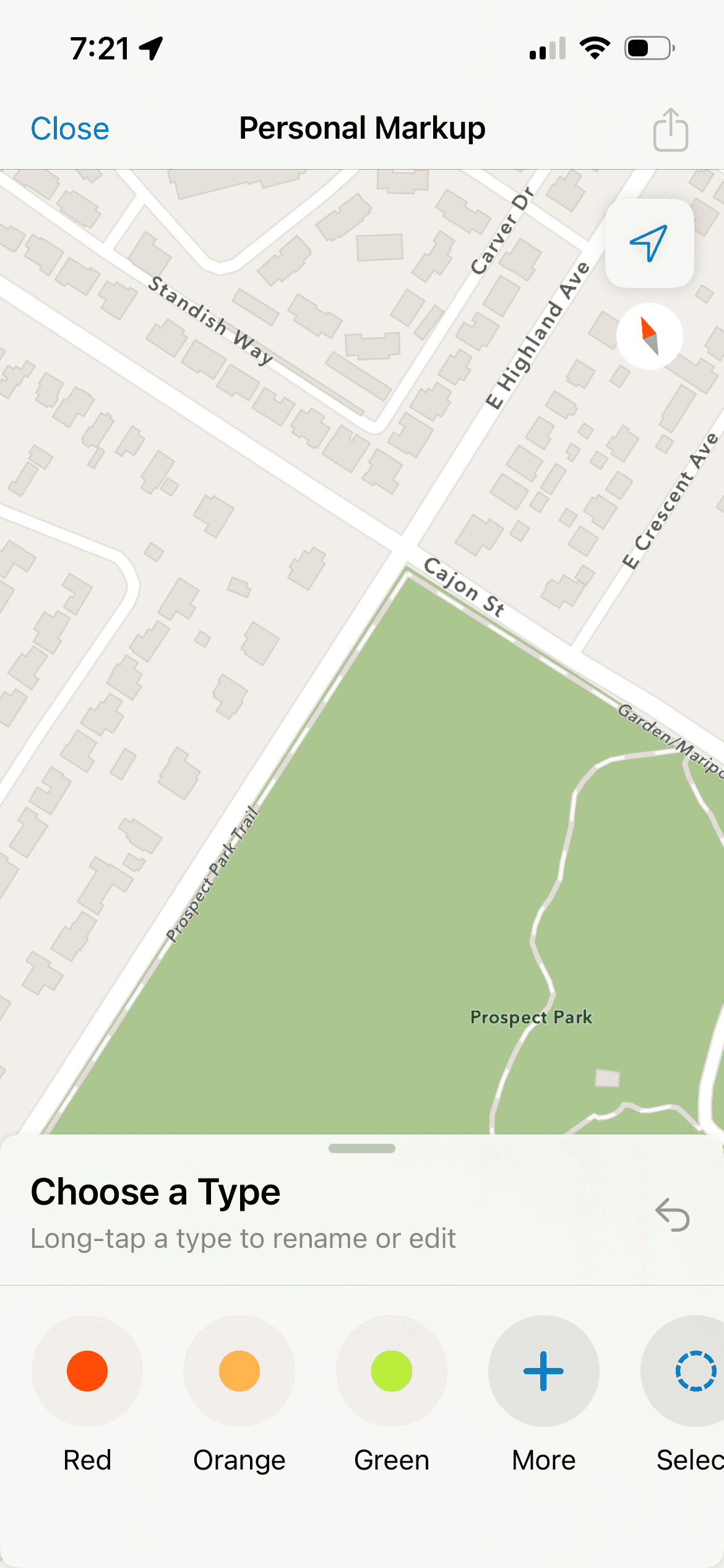
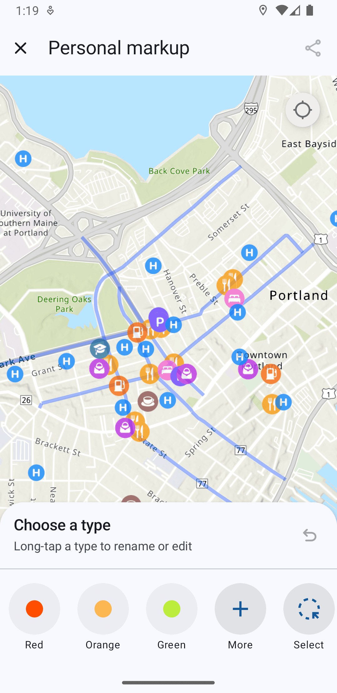
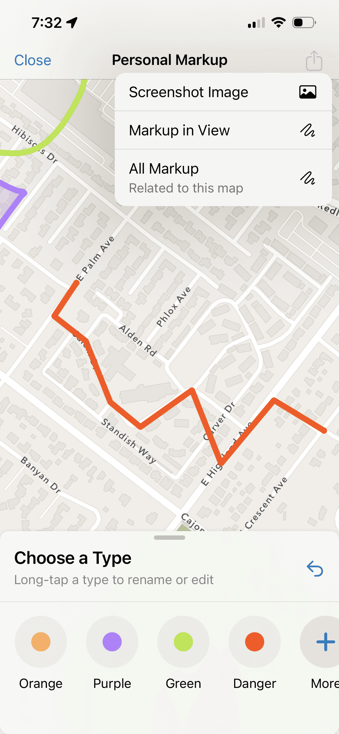
Labeling Types
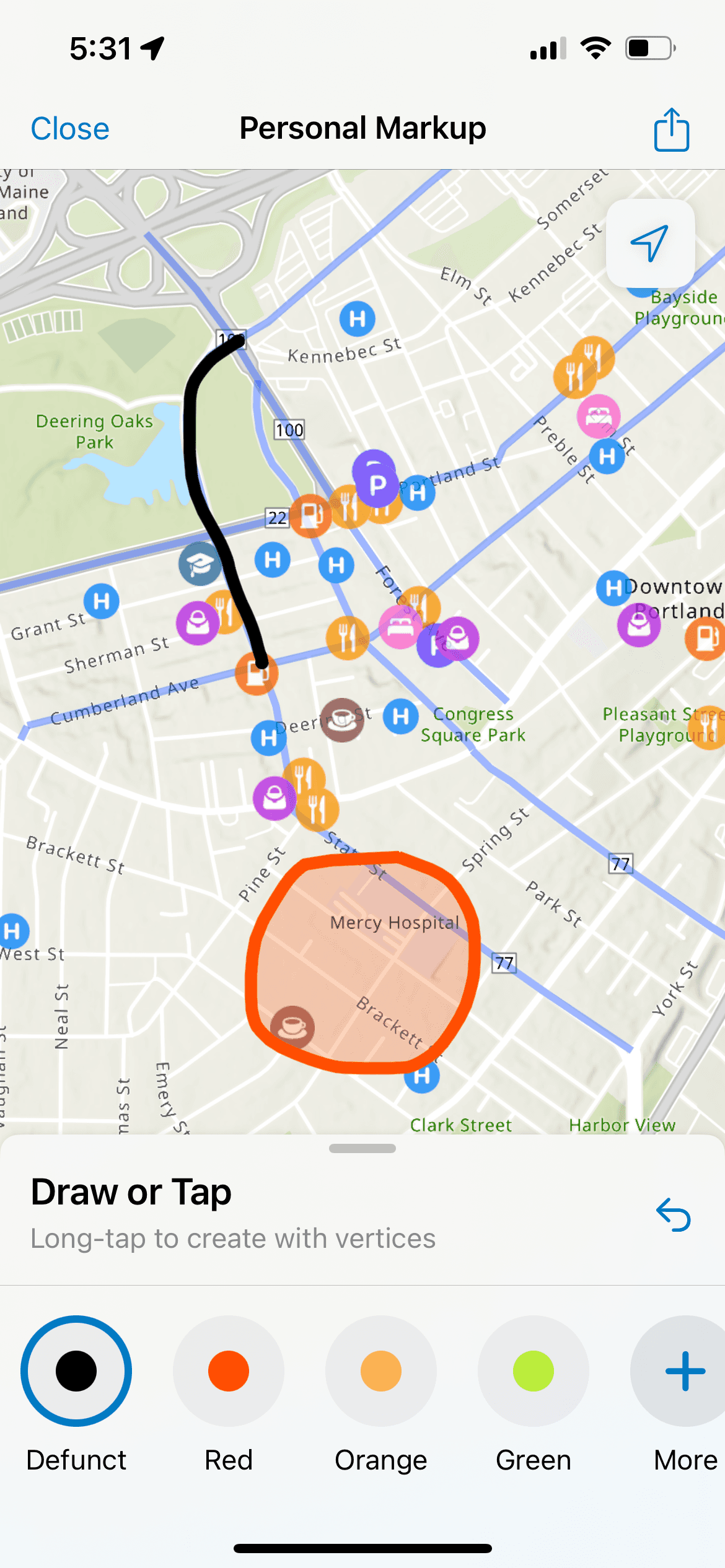
Instructional text for Actions
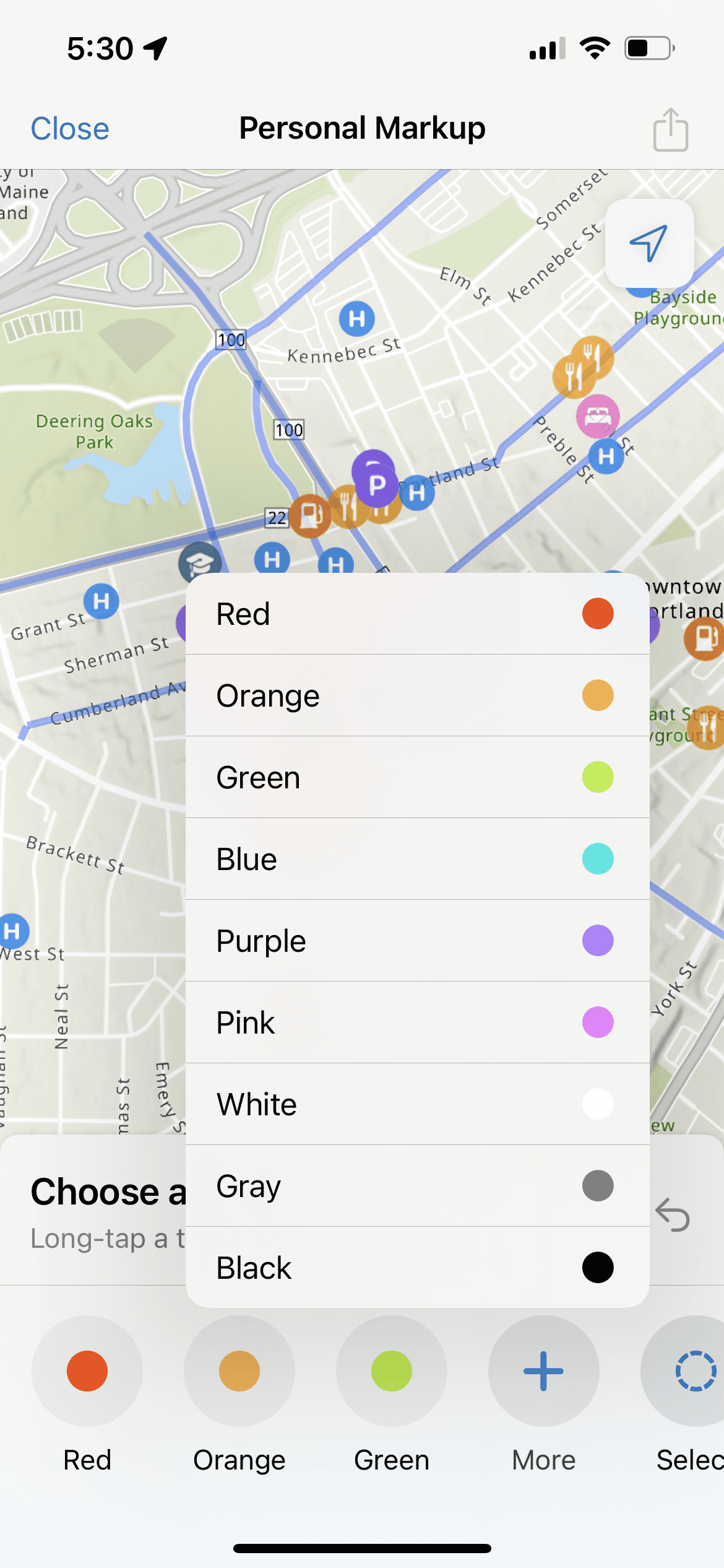
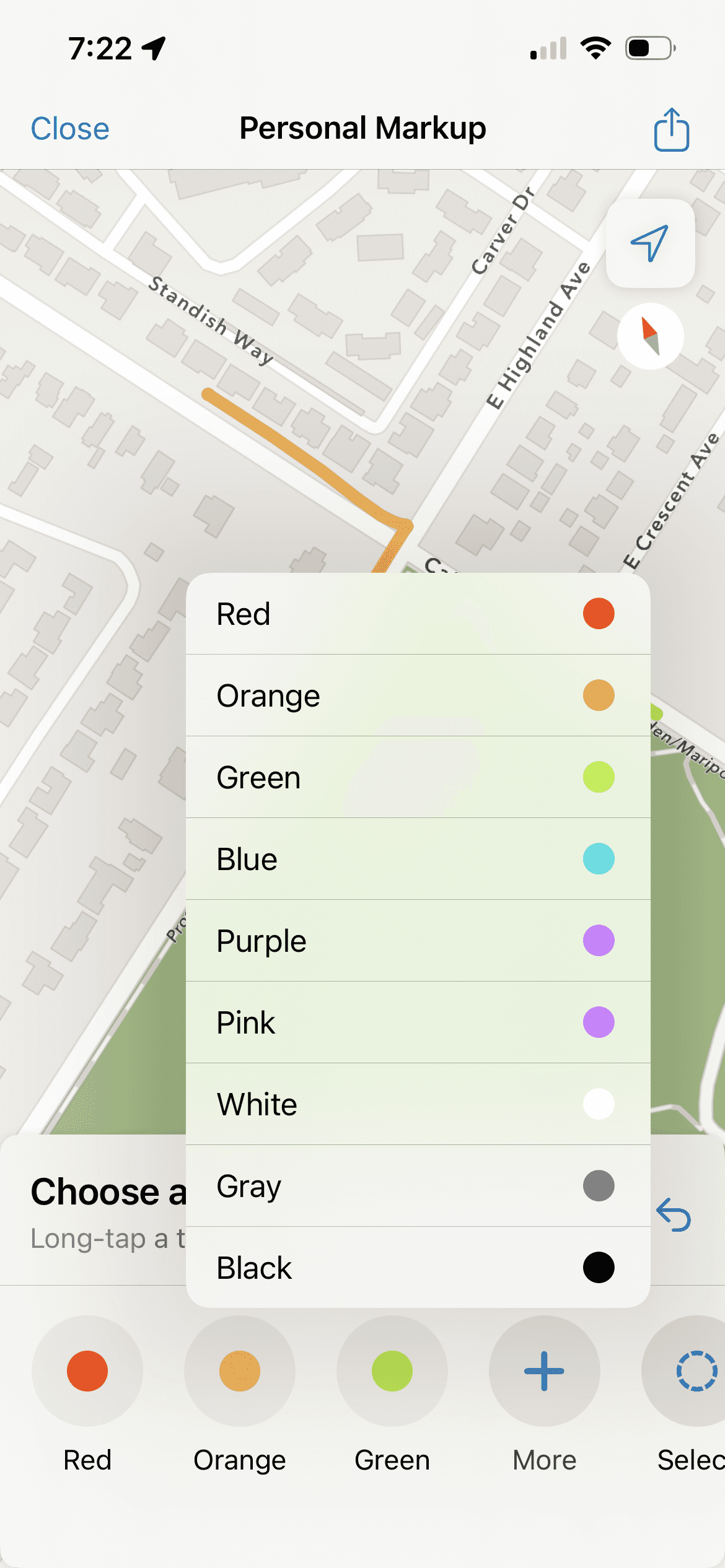
Ability to Choose Color/Rename Type first
Map pans with one finger to follow regular pattern
Explicit Undo Tool where there was no such action before
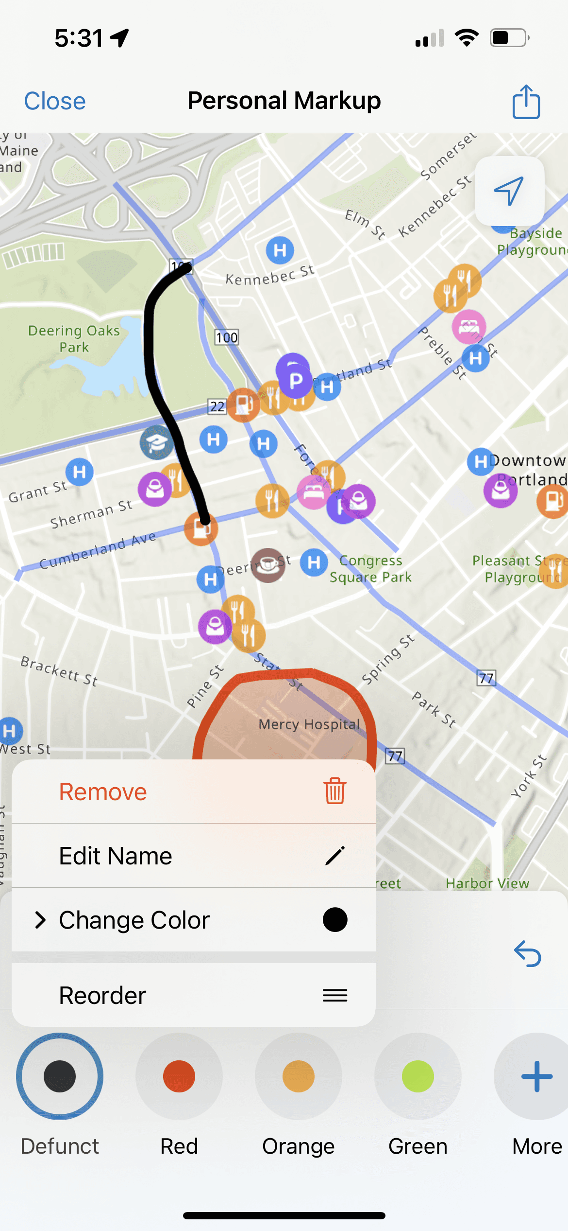
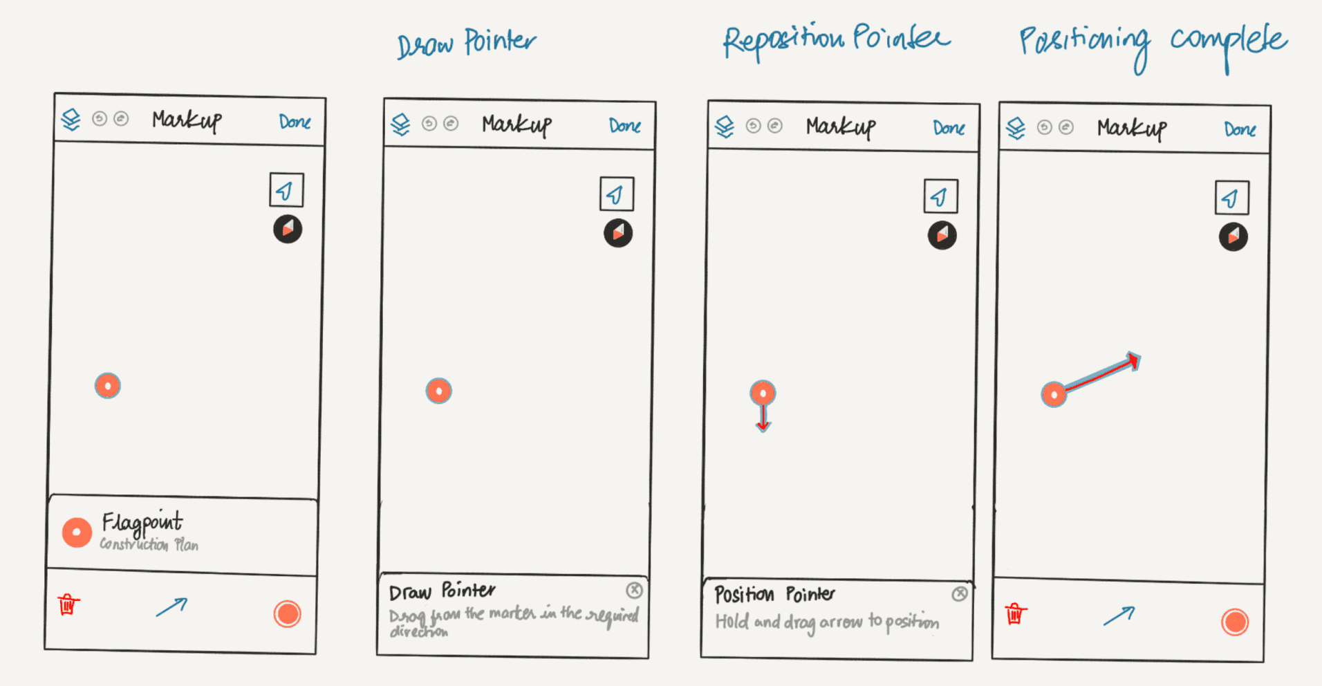
Selecting and Renaming Markup Types before and after drawing
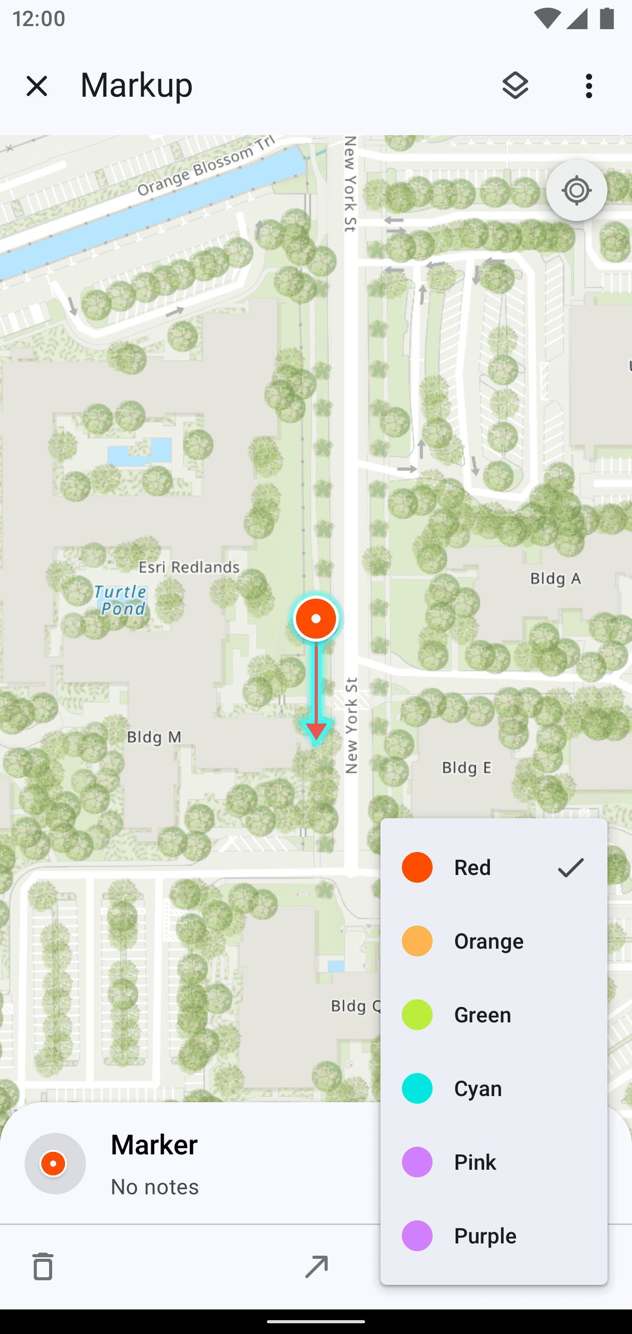
Separated Color and Type so they can be changed independently


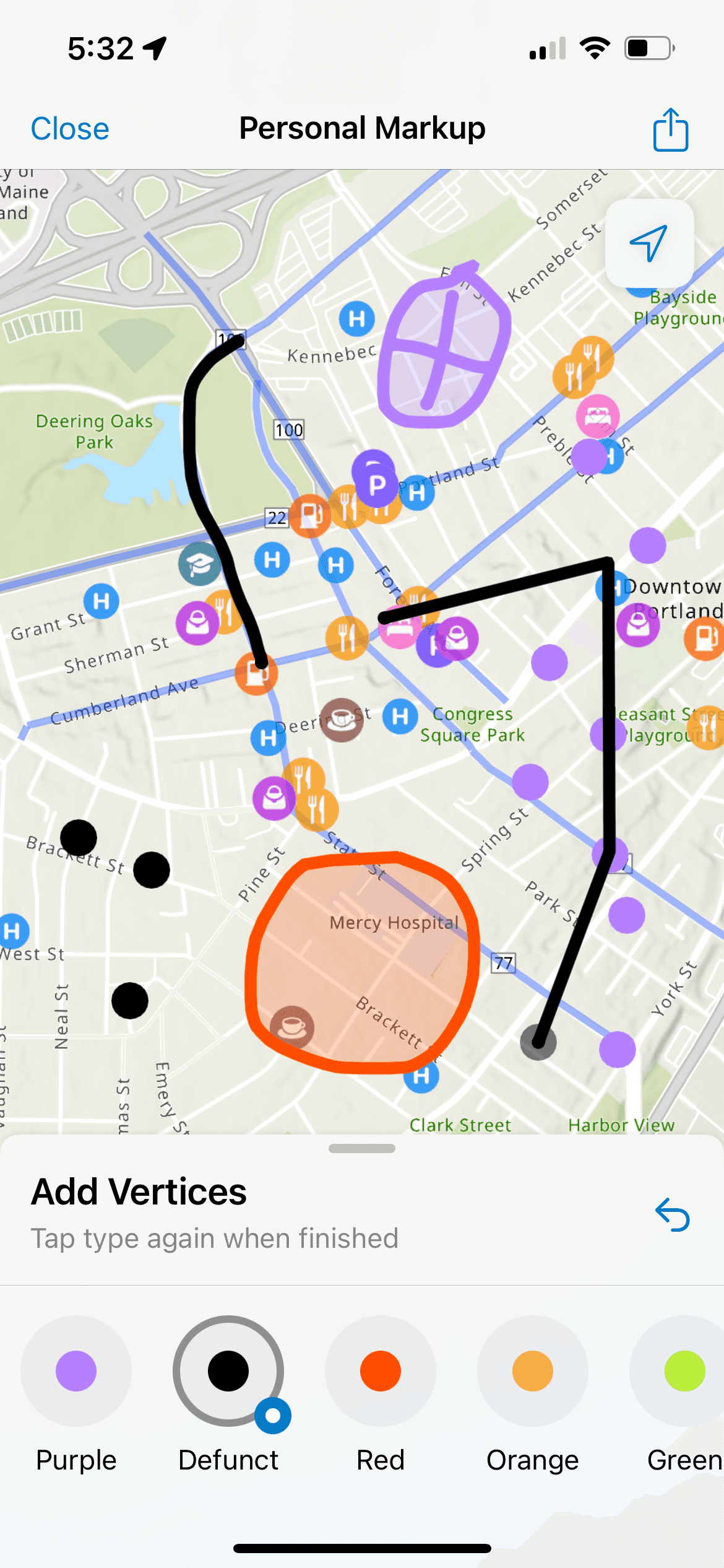
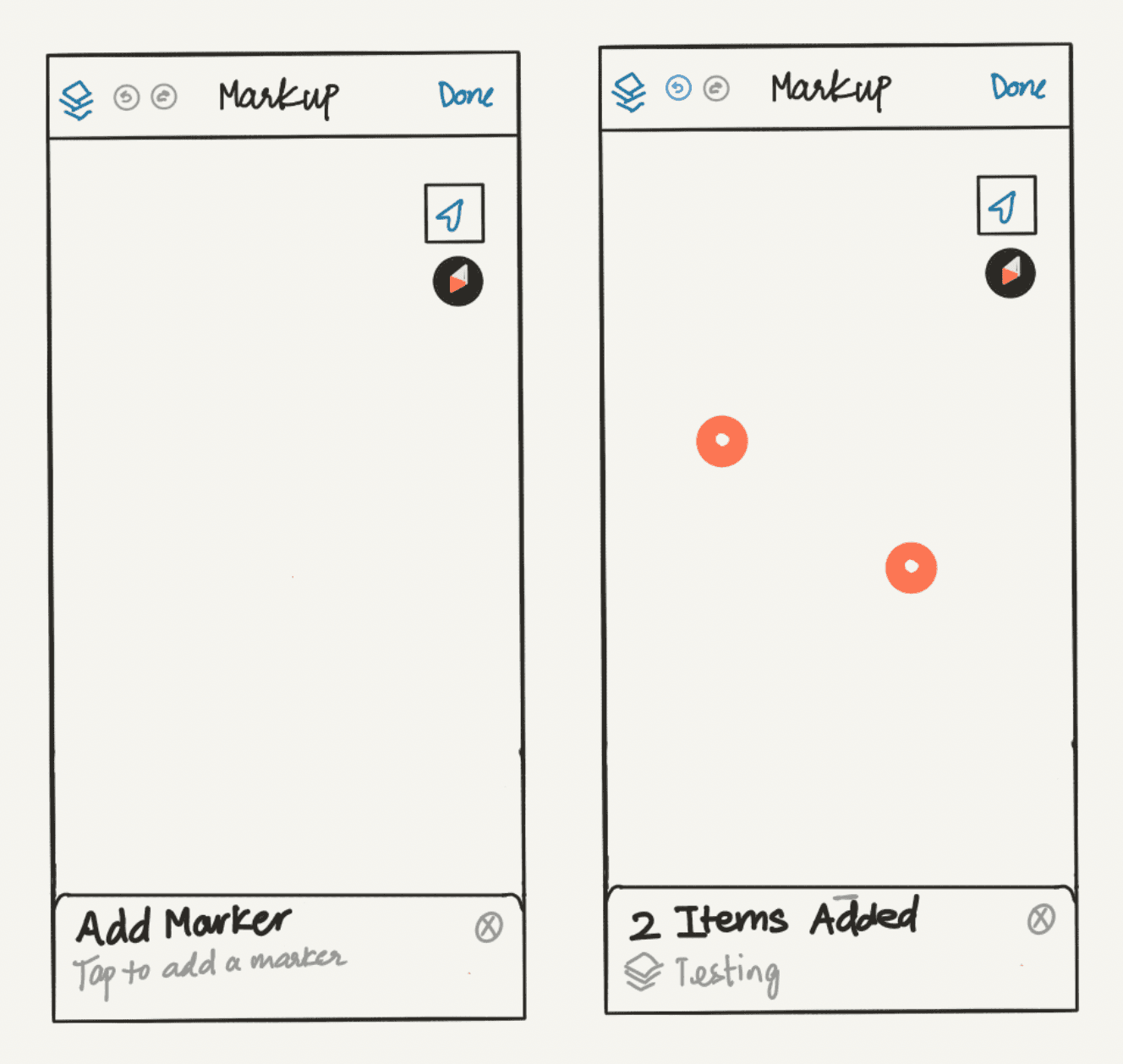
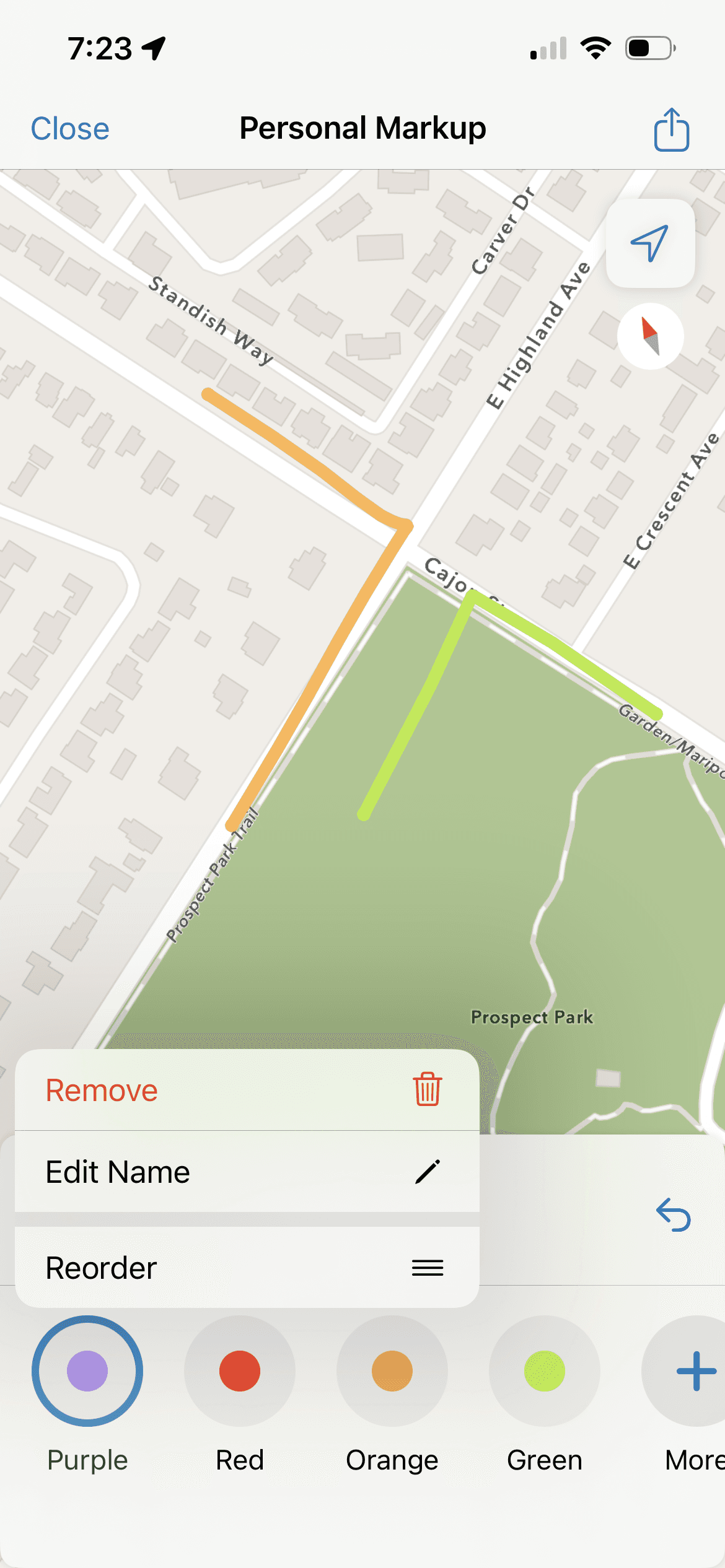
Draw Multiple of One Type
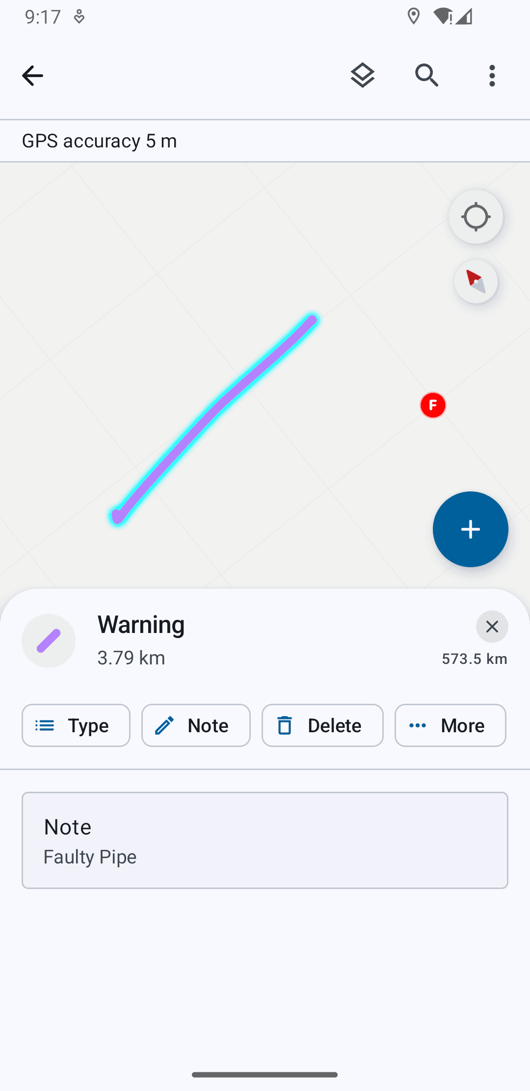

Item View + Actions Outside Markup Tool
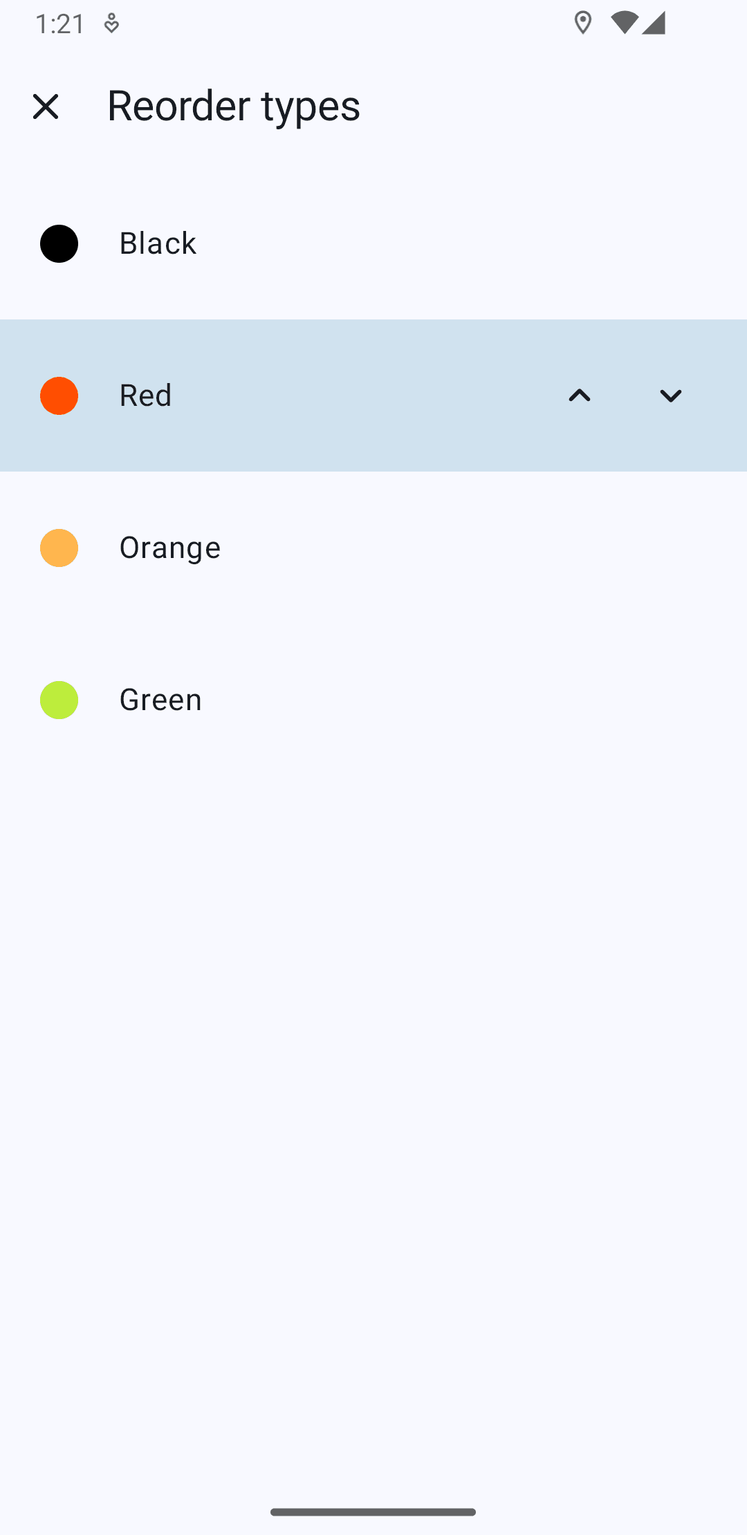
Manually Reorder Types Based on Priority
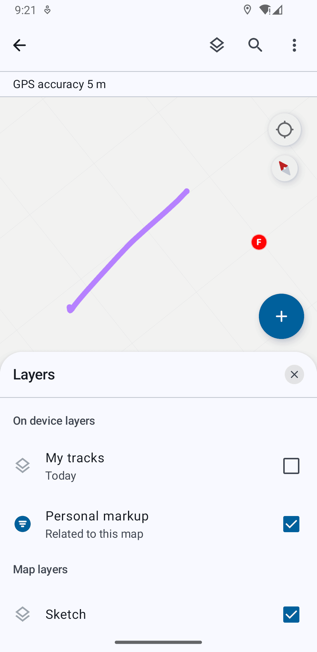
Adjust Markup Layer Visibility
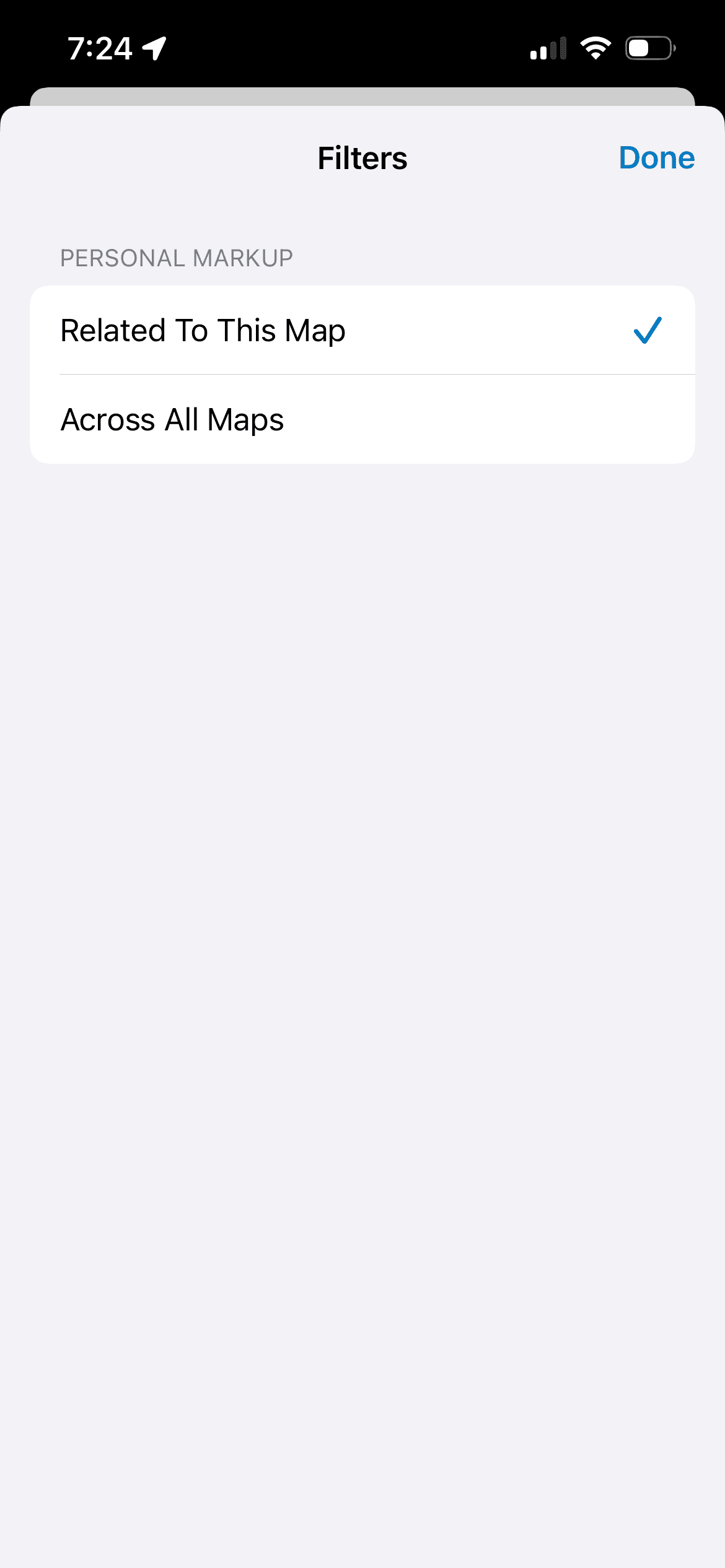
Share Options Based On Layer Visibility
Larger Form Factors
Stylus Support
Detecting the use of a Stylus/Apple Pencil for precise drawing.
In this state, the user can pan and zoom on the map as usual with their fingers, while drawing is reserved for the stylus.
HOW ARE WE RESPONDING?
As organizations and users migrate to the new rebuild of Field Maps that was released only in October 2025, we continue to monitor telemetry and user feedback through the different channels of communication that the team maintains. Spanning the last two months, we’ve had over 3,000 unique users carry out sets of actions in the new markup tool.
Ideation and iteration based on incoming user suggestions remains ongoing.